Lucky 7 Boba


For this project, I wanted to reimagine the identity of a boba shop by giving it a more fun, youthful, and energetic look. Boba culture has become a staple for younger audiences, and I aimed to design a visual system that felt playful while still maintaining a sense of brand consistency.
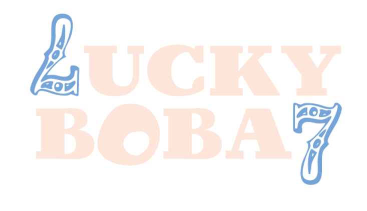
I started by exploring symbols of luck and positivity, which led me to incorporate the iconic lucky cat and the number seven. These elements instantly gave the brand a lighthearted and approachable personality. To balance tradition with a modern twist, I combined these icons with bold typography and vibrant accent colors, including bright orange, soft pastels, and a standout red base. This color palette keeps the branding cheerful and eye-catching, perfect for packaging and promotional materials.
For typography, I paired Birra Stout for headings with Century Gothic Pro for body text. This combination allowed me to capture a strong, confident voice for the logo and headers while keeping the overall reading experience clean and friendly. The execution included creating a repeat pattern with the lucky cat and popsicle icons, designing a playful logo with integrated “7s,” and applying the system across layouts like packaging mockups and menus. By leaning into fun illustrations, whimsical icons, and bold contrasts, I crafted a rebrand that speaks directly to a younger audience who values both aesthetics and experience.
Lucky 7 Boba is not just about selling drinks—it’s about creating an inviting brand world that feels lucky, fun, and memorable with every sip.

