Boston Local Markets
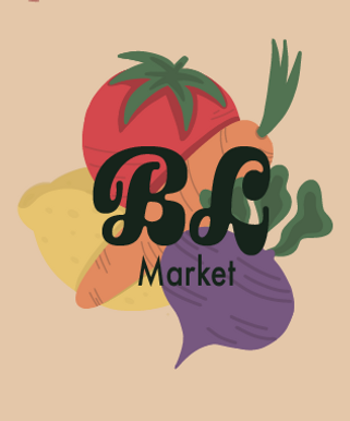
For my Boston Local Markets brand identity project, I created a cohesive visual system that captures the spirit of local community, fresh produce, and Boston pride. The identity highlights the market’s focus on supporting local farmers and makers while connecting directly with the city’s culture and history.
The design includes a clean and versatile logo system with both wordmark and symbol variations, along with a carefully chosen color palette and typography that feel both modern and approachable.
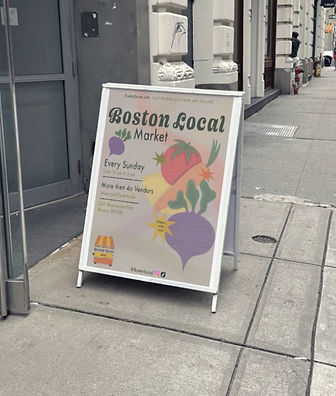
The branding is designed to be flexible, working seamlessly across signage, packaging, social media, and promotional materials.
My goal was to create an identity that feels rooted in Boston, celebrating community, tradition, and freshness, while also looking polished and professional for a wide audience. This project challenged me to think deeply about what makes a farmers' market brand memorable and how design can communicate authenticity, trust, and local pride.